Section
Benefits of this component
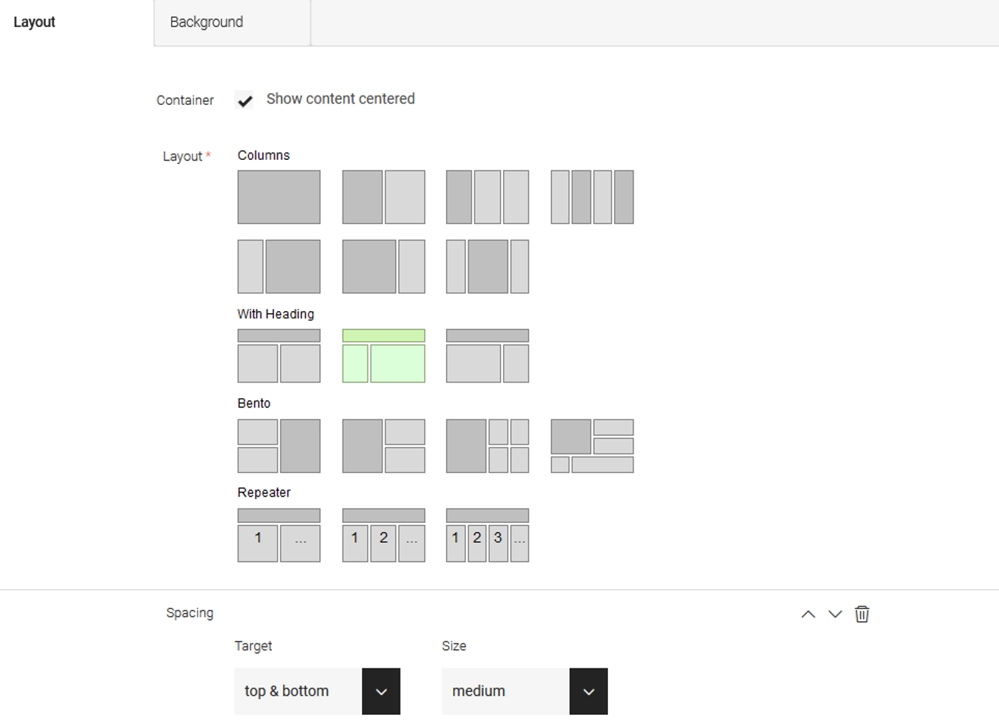
- Customizable Layout Chooser: Tailor your layouts exactly to your specifications with ease.
- Personalized Background Images and Colors: Make your content pop with visually stunning backgrounds that reflect your brand identity.
- Flexible Spacing Control: Say goodbye to rigid designs - adjust spacing effortlessly for the perfect balance.
- Repeater Layouts for Teasers or Lists: Streamline your content presentation with repeatable layouts for teasers or lists.
- Container Wrapper: Add versatility to your content presentation by utilizing full-width or max-width configurations with ease.
- MIT License: Enjoy the freedom to use and modify the component with confidence.
How the dialog looks like
How it looks in the page editor

How to customize
This component is meant to be downloaded and customized to your needs. Unlike other component libraries, we follow the approach of building your own component library based on our code. The section comprises three essential files.
Template:
As already mentioned, the template CSS looks similar to the LayoutChooser. There are some differences in the repeater fields, but all the other grid options are identical.
Dialog:
You can customize the dialog and add more fields and options. One of the fields is the jsField (layoutChooser). You can customize these options with the jsField HTML.
Columns
Grid1
Grid2
With Headings
Grid1
Grid2
Grid3
Bentos
Grid1
Grid2
Grid3
Grid4
Grid5
Repeater
Grid1
Grid2
With Background Color
Grid1
Grid2
Contact the author