Component Chooser
We have created multiple variants of a redefined component chooser. All choosers have an image icon to point the purpose of the components up visually. You can choose it on your own needs and preferences of your users.
The image icon itself is specified in each component template definition as a parameter.
title: "Disqus"
dialog: ...
templateScript: ...
parameters:
  icon: /.resources/magnolia-central-module/webresources/icons/disqus.svg
Radio Button Component Chooser
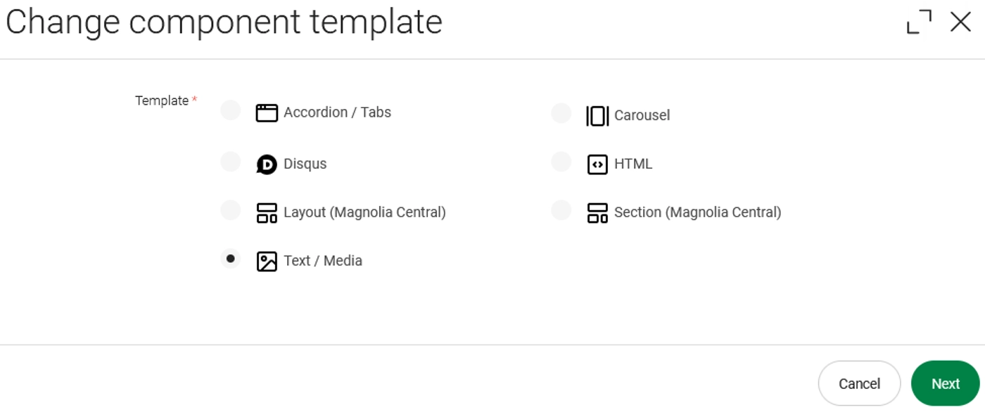
The radio button variant could be added by adding the datasource and a specific stylename.
form:
  properties:
    "mgnl:template":
      $type: radioButtonGroupField
      styleName: "image-radio"
      datasource:
        name: image-available-component-templates
Grid Based Component Chooser
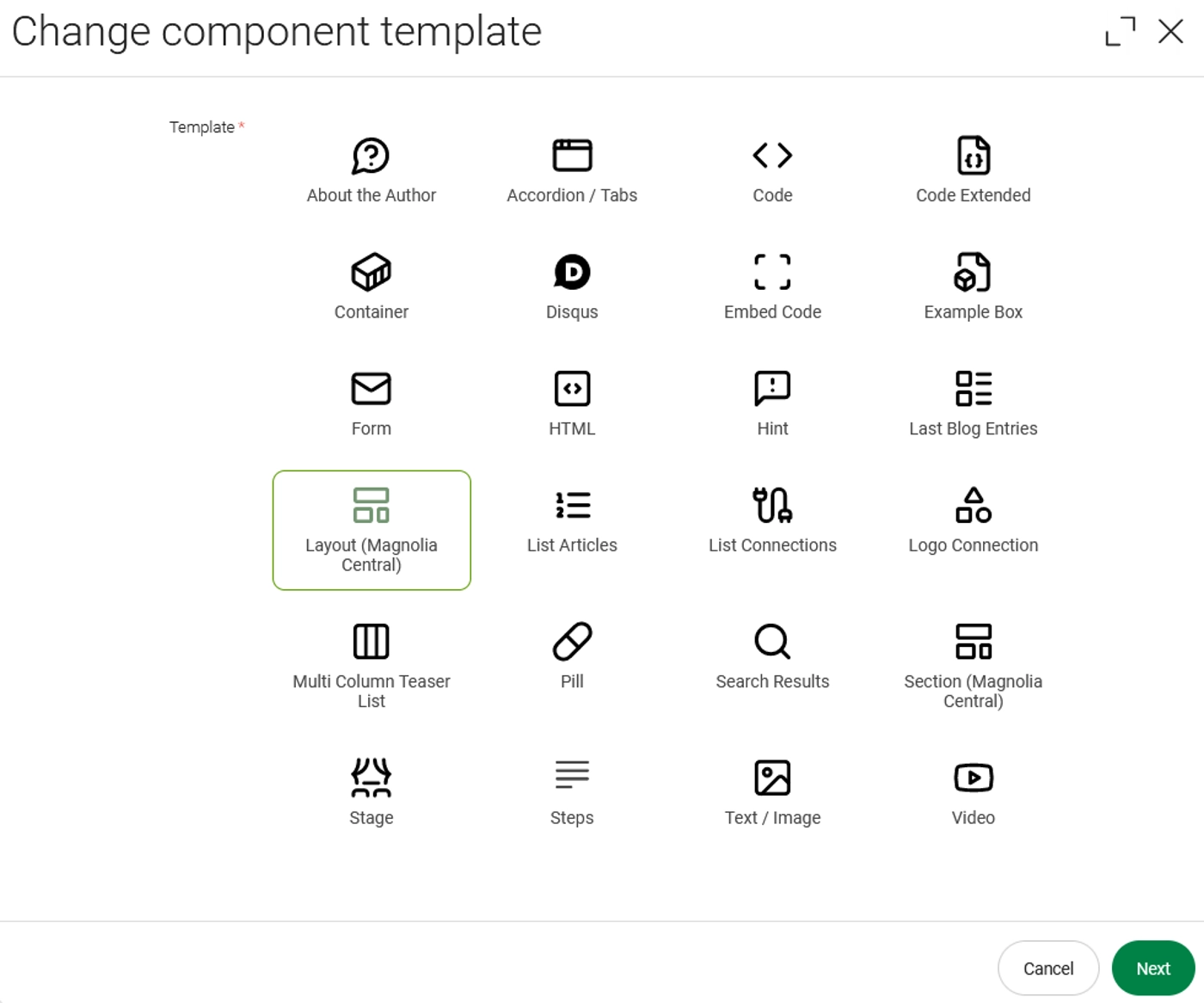
The grid variant could be added by adding the datasource and a specific stylename.
form:
  properties:
    "mgnl:template":
      $type: radioButtonGroupField
      styleName: "image-grid"
      datasource:
        name: image-available-component-templates
Combobox Component Chooser
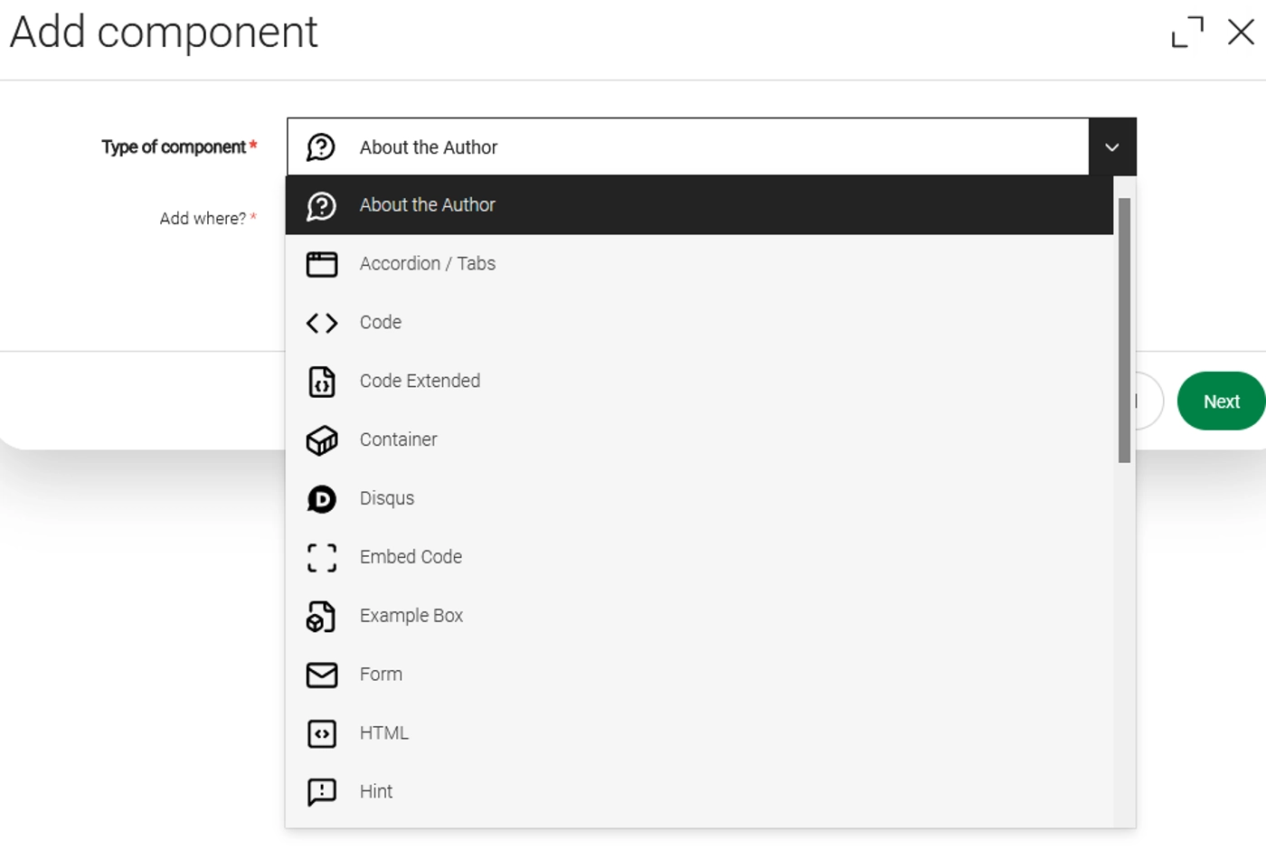
Since the combobox is the default behaviour, all you need to add is the datasource, which points to the java class.
form:
  properties:
    "mgnl:template":
      $type: comboBoxField
      datasource:
name: image-available-component-templatesContact the author